Screen Settings
Every screen on the account has a page of its own, and this is it: what it plays, how the player behaves, who holds the license, and what the device reports back.
Two routes open it, and both land on the same page.
- From the Screens section – every row of the Screens list ends with
View Detailin theACTIONcolumn. Click it on the row of the screen you want. - From the Dashboard – the
SCREEN / PLAYERSregion lists the screens that responded most recently, and every row there carries aViewbutton.
Whichever you use, the page opens on the Media tab, with the nine tabs across the middle.
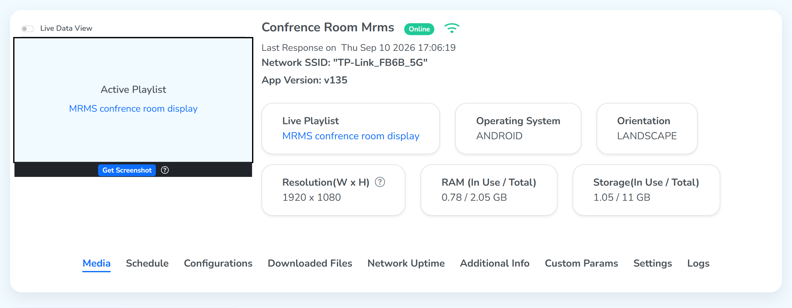
See what a screen is playing
The panel opens with a preview box on the left, and two controls decide what it shows. Both answer the same question – what is this screen showing right now?
Live Data View
The toggle sits above the preview. Switch it on and the CMS shows the content in the preview box.
It uses what the CMS already has. If the playlist was made in the CMS and published from there, the preview shows it.
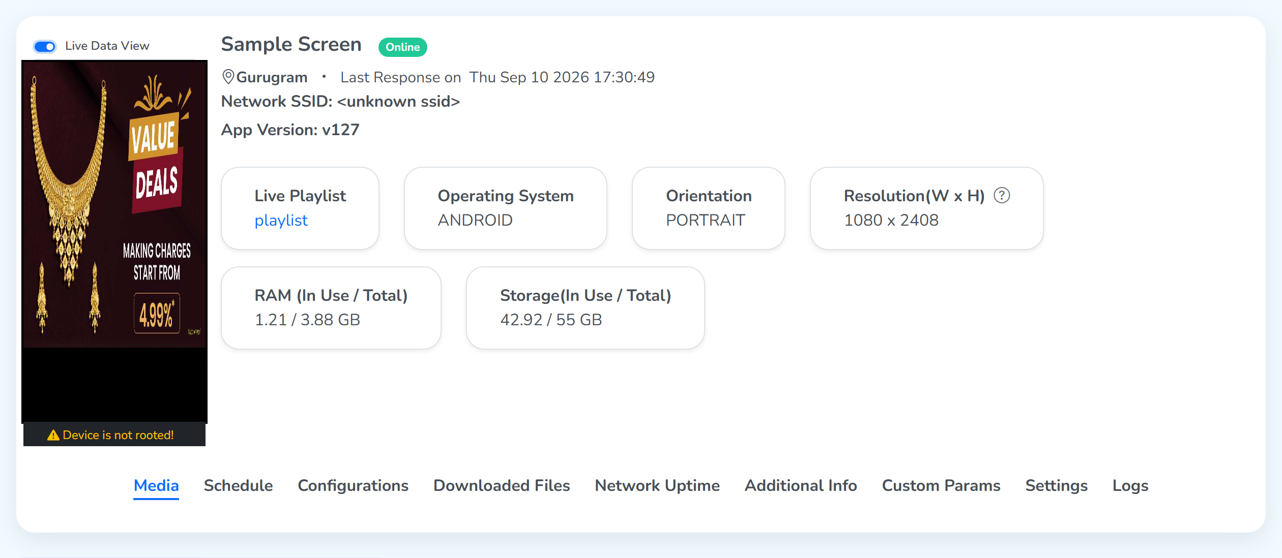 Its OS is locked downFetches from the CMS
Get Screenshot
The blue button on the dark strip under the preview. Click it and the screen sends back a picture of what it is showing, with the date and time on it.
Use this for content made outside the CMS. A web page made elsewhere is only on the device, so leave Live Data View off and Get Screenshot brings back that picture.
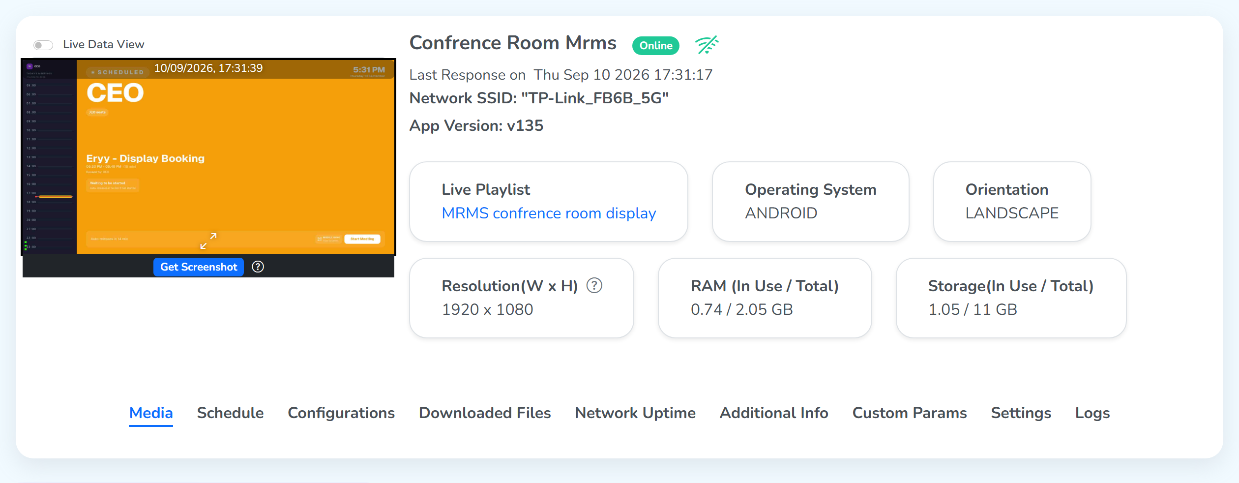 From the screen, not the CMSNeeds a rooted device
The button needs two things: the screen has to be online and playing, and the device has to be rooted. On a sealed device the strip shows Device is not rooted! instead of the button.
What “rooted” means: a rooted device is one whose operating system can be opened up and changed, instead of being locked by the maker. A screenshot needs that access, because the player app has to read the whole display, not just its own window.
Screen details on this page
The lines at the top
The screen’s name, a green Online icon while the player is connected, and a signal icon once the device names its network. Under it:
- Location: the city the screen stands in, on a map pin.
- Last Response on: when the player last checked in, to the second.
- Network SSID: the wireless network our display device is joined to.
- App Version: the player app build on the display.
The status cards
Live Playlist: what is playing now. This card is clickable and takes you to the playlist.- Operating System: the platform the player runs on.
- Orientation: how the display is mounted: LANDSCAPE or PORTRAIT.
- Resolution (W x H): the display’s pixel size. Move your cursor to the ? on this card to confirm the device reported it.
- RAM (In Use / Total): how much of the device’s memory is being used, out of how much it has.
- Storage (In Use / Total): how much of the device’s space is filled, out of how much it has.
Media
The tab the page opens on. It shows what the screen is playing, and the controls to change it.
Two views at the top of the panel:
ACTIVE CONTENT (N): what the screen is playing right now. The number is how many playlists and files are assigned to it.ASSIGN PLAYLIST: the picker for sending a different playlist.
Clear Content, red, at the far right, removes all the content assigned to the screen in one action: the scheduled playlists, the direct playlist and the individual files together. A dialog asks you to confirm first, and warns that the removal is permanent.
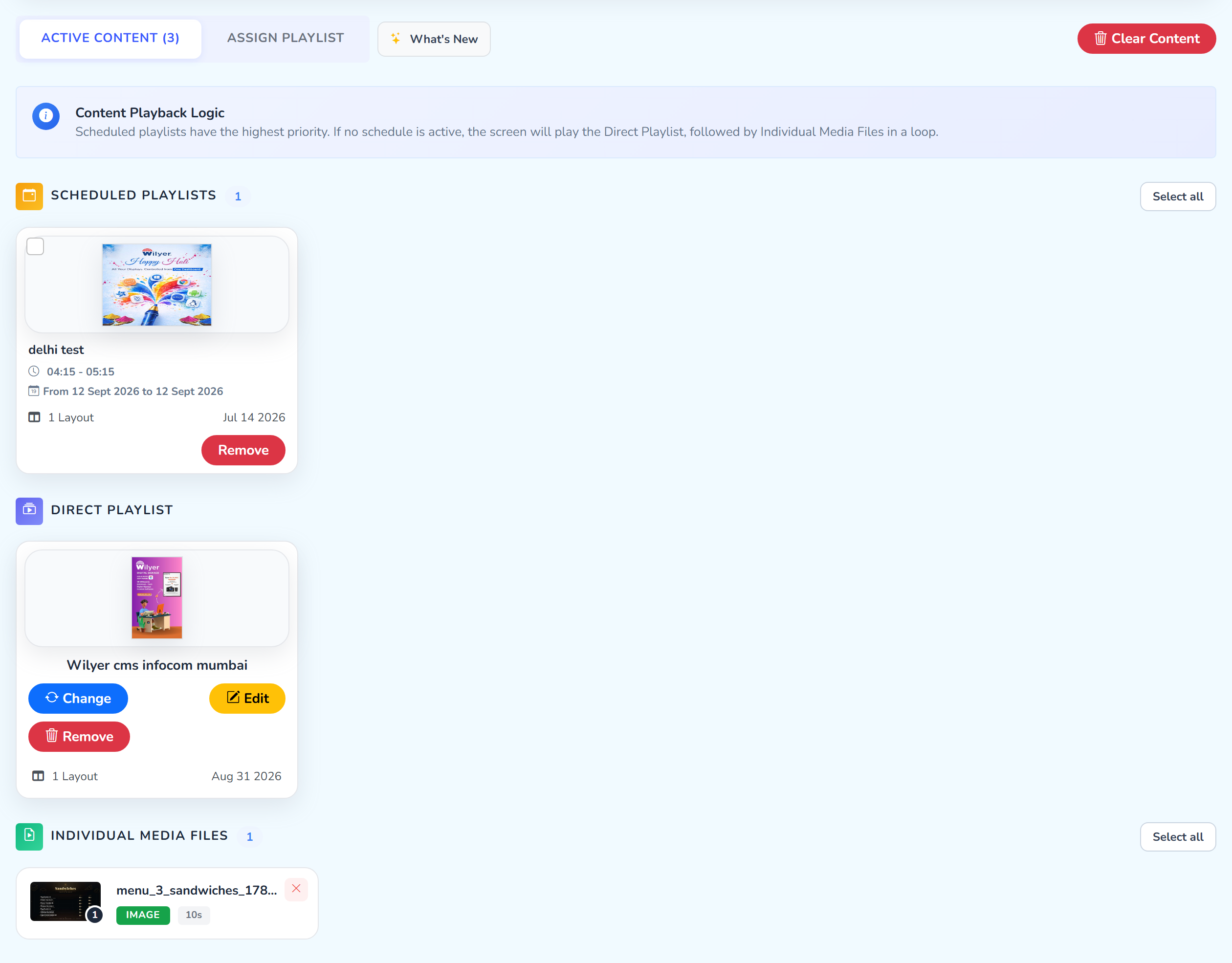 How many items the screen holdsClears all of itHighest priorityEqual weight, these two loop together
How the screen decides what to play. A screen can hold three kinds of content at once, and the CMS ranks their priority as:
Scheduled Playlist   >   Direct Playlist   =   Individual Media Files
(highest) (lowest)- A scheduled playlist plays inside the time window you set. When that window opens, the CMS plays it before anything else. That is why it is highest.
- A direct playlist is one built and published straight to this screen.
- Individual media files are files sent as they are, downloaded directly and without making a playlist from them (inside Library › Media Files).
The last two have the same priority, so they play together, one after another, in a loop. This is the default.
Assign a playlist. Click ASSIGN PLAYLIST to open the picker. Remove Playlist, red, on the right, unpublishes the current playlist from this screen and leaves the individual files in place.
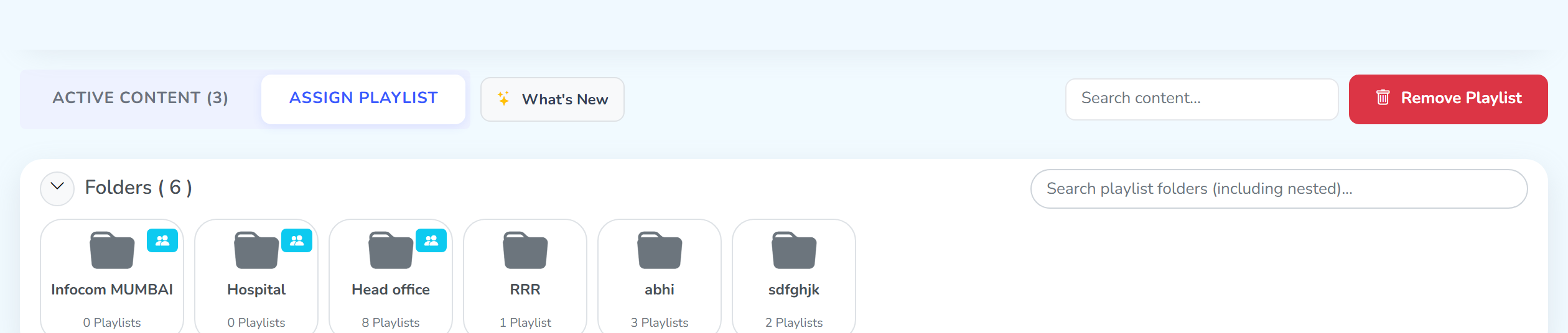 Opens the pickerUnpublishes it from this screen
These are playlist folders. The count in this panel differs from the Library’s, because the two are separate sets of folders.
Below the folders, every playlist you can send is a tile with two buttons:
Editopens the playlist to change what is inside it.Publishsends it to the screen. Click this one with care. The content starts playing within seconds and replaces the playlist that was there.
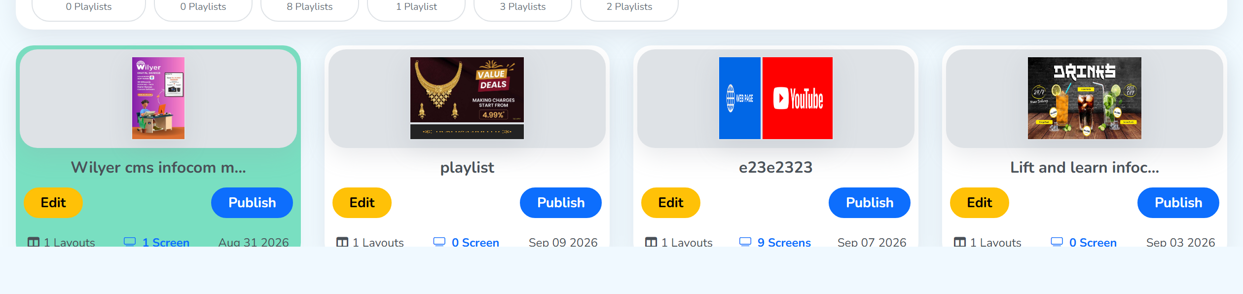 Opens the playlistSends it to the screen
Publishing a playlist replaces the one playing before. Live Data View shows the swap.
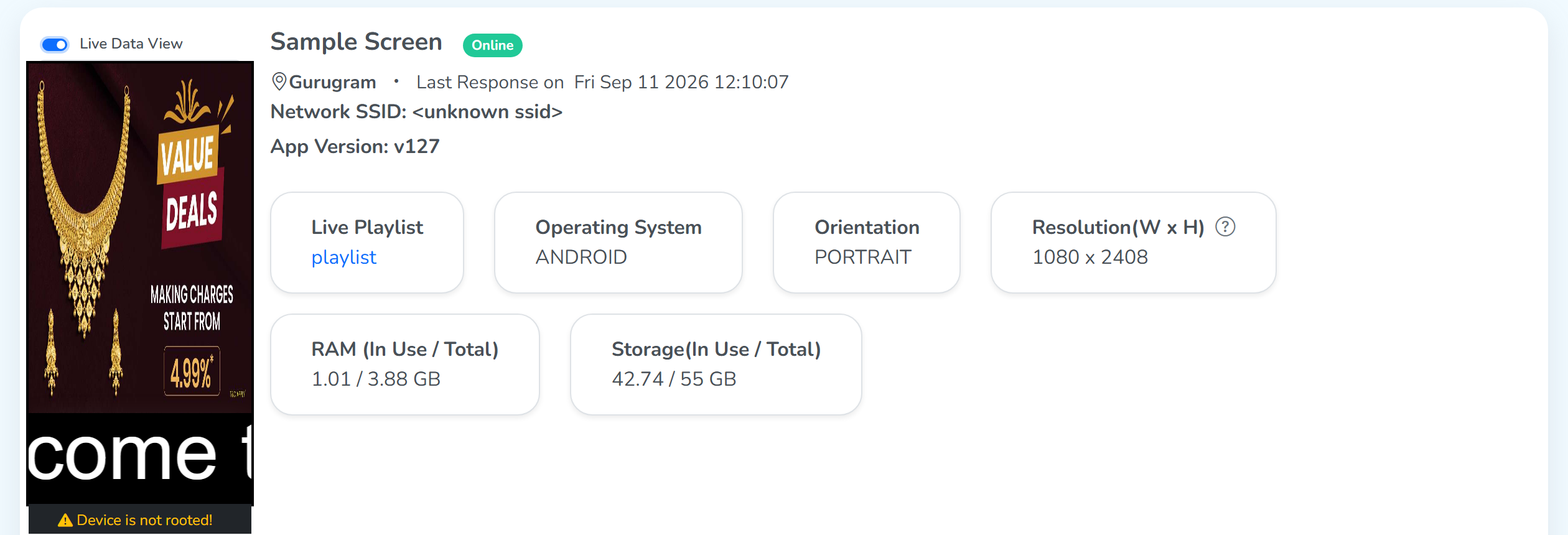 What was playing
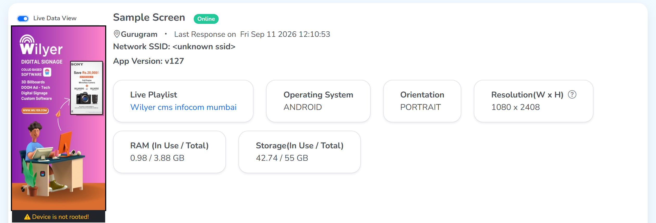 What replaced it
Schedule
Every playlist scheduled onto this screen, one per row, in the All Schedules table. Each row sets a window. It is the time duration in which the scheduled playlist appears on the screen.
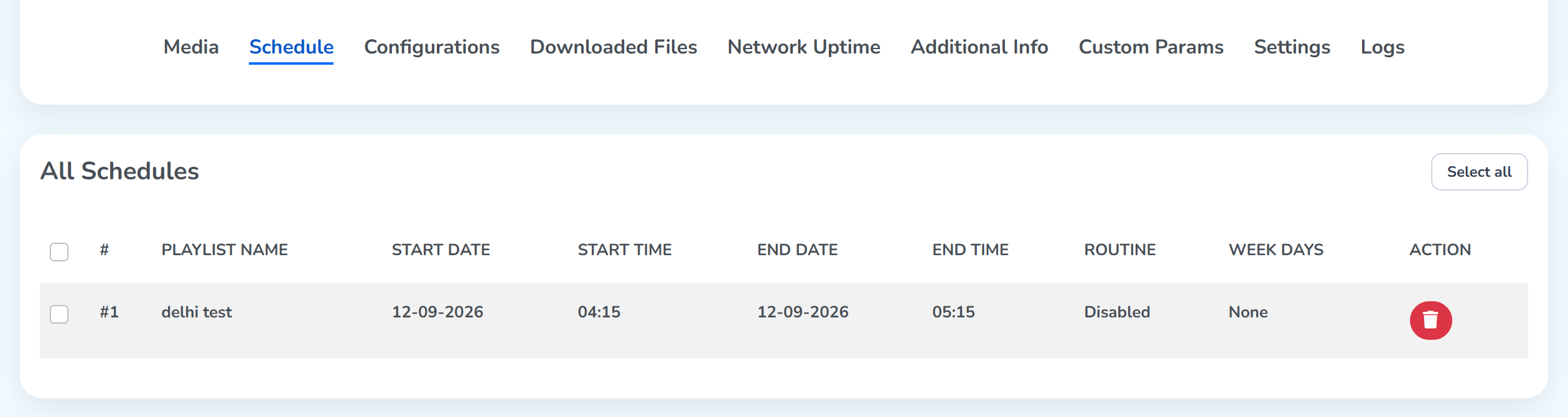
The columns, left to right:
#: the row number, and a checkbox beside it.Select allat the top right ticks every row at once.PLAYLIST NAME: the playlist that plays during this window.START DATEandSTART TIME: the date and time the window starts.END DATEandEND TIME: the date and time it ends. After that the screen goes back to the rest equal priority media.ROUTINE:Enabledrepeats the window on the days listed in Week Days;Disabledruns it once, for the date range only.WEEK DAYS: the days a routine runs on. It readsNonewhen Routine is off.ACTION: the red delete button removes that schedule from the screen.
The times follow the display’s own clock, not the clock of the person who set them. A screen in another time zone starts at that time locally.
We have discussed how content is scheduled in the Schedule a playlist document, under Playlists. Read it and publish your first scheduled playlist.
Configurations
Everything that controls how the player behaves on the device. Save Configurations sits at the top right and again at the foot, and one click commits every change on the page.
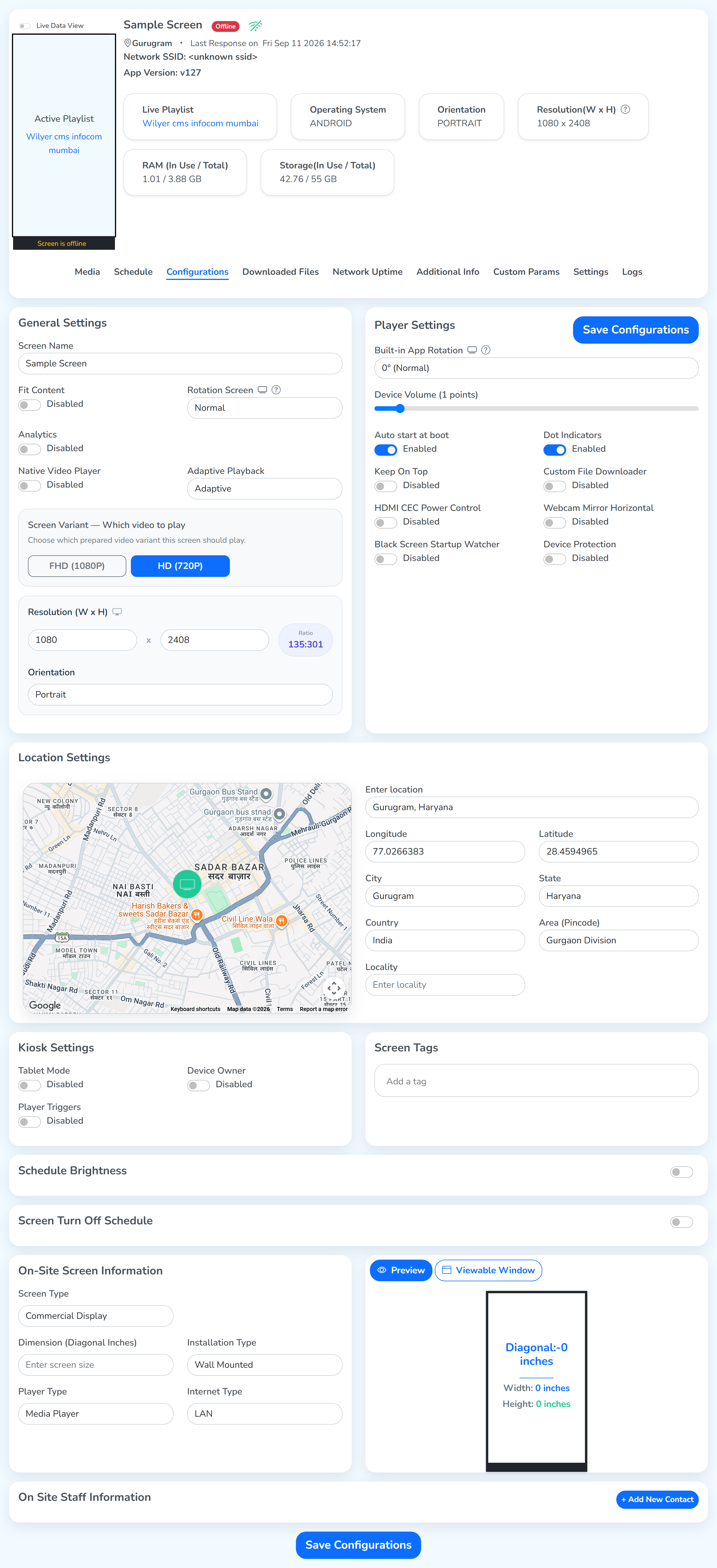
General Settings
The screen’s name and how content is drawn on it.
- Fit Content: stretches media to fill the whole screen even when the aspect ratio differs.
- Rotation Screen: rotates the entire content on the screen, through the device’s own orientation sensor. For a device with a gyroscope.
- Analytics: sends what this screen played back to the CMS. Where to view it? Check the media analytics of a file.
- Native Video Player: uses the OS’s own video player apart from our digital signage.
- Adaptive Playback: for files of different resolutions.
Adaptiveadjusts each file to the screen, so every file plays properly.Originalshows each file at its own resolution. - Screen Variant, Which video to play: which prepared video variant this screen plays,
FHD (1080P)orHD (720P). - Resolution (W x H): the width and the height, with the ratio worked out beside them.
- Orientation: landscape or portrait, the way the player lays the content out. It is separate from Fit Content.
Player Settings
How the player app itself behaves on the device.
- Built-in App Rotation: rotates the content inside the app itself. For a media player and other devices that leave rotation to the app.
- Device Volume: system volume, from mute upward.
- Auto start at boot: launches the player when the device powers on.
- Dot Indicators: shows three dots on the screen, in blue or green:
- Top dot: the WiFi connection.
- Middle dot: the web socket status: connected, server down, or connected with no internet.
- Bottom dot: turns red when the screen’s date or time is wrong or out of sync.
- Keep On Top: gives the player app priority. Other apps may still be visible, and the player is the app that responds.
- Custom File Downloader: content published from the CMS is downloaded on the screen before it plays. This option sets the screen to use its own downloader for that.
- HDMI CEC Power Control: for a screen that gets its content from a separate hardware player. When the player turns off, the screen turns off with it.
- Webcam Mirror Horizontal: also for a separate hardware player. It connects the player to the screen through a USB-to-HDMI adapter, which takes the USB input and shows it on the screen over HDMI.
- Device Protection: the player app has a sidebar on its left. Turn this on and set a password here, and the sidebar asks for that password before it shows its settings.
Kiosk Settings
A kiosk is a device that runs one app alone, for the public to use. Like the device that is used to book tickets digitally on a station.
Three toggles, each one reading Enabled or Disabled.
- Tablet Mode: hides the sidebar in the player app.
- Device Owner: gives the player owner-level (root-level) permissions. Turn it on, and three more settings appear:
- Default Launcher: the device starts straight into the player app.
- Kiosk Mode: keeps the player app locked open.
- Lock Device Settings: hides the Android settings section in the sidebar.
- Player Triggers: changes the content when something happens, such as a touch or a change of location. The triggers on offer depend on your player version, and some versions have more advanced settings.
On-Site Screen Information
A record of the hardware itself. It lives in the dashboard for support and field teams.
- Screen Type: commercial display or LED.
- Dimension (Diagonal Inches): the screen’s diagonal. The preview beside it carries the diagonal, the width and the height.
- Installation Type: wall mounted, self standing pod, or other.
- Player Type: media player, SOC, mini PC, or other.
- Internet Type: LAN, WiFi, dongle, or mobile data on an embedded SIM.
Viewable Window
In the On-Site Screen Information region of the Configurations tab, the panel beside the fields has two buttons: Preview and Viewable Window.
In this screenshot, Viewable Window is clicked and Custom Zone is switched on. The width and height are changed, and the yellow box on the grid shows the new size of the zone.
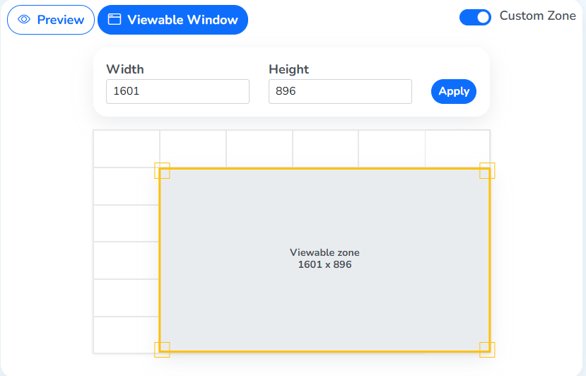 Viewable Window clickedCustom Zone onSize changedThe CMS treats this as the full screen
This zone becomes the screen’s full display size. For example, set the zone to half of the grid and save the configuration. When you then publish content to the full screen, the CMS treats that half as the full screen and plays the content there.
Downloaded Files
The files the device has actually downloaded and cached locally.
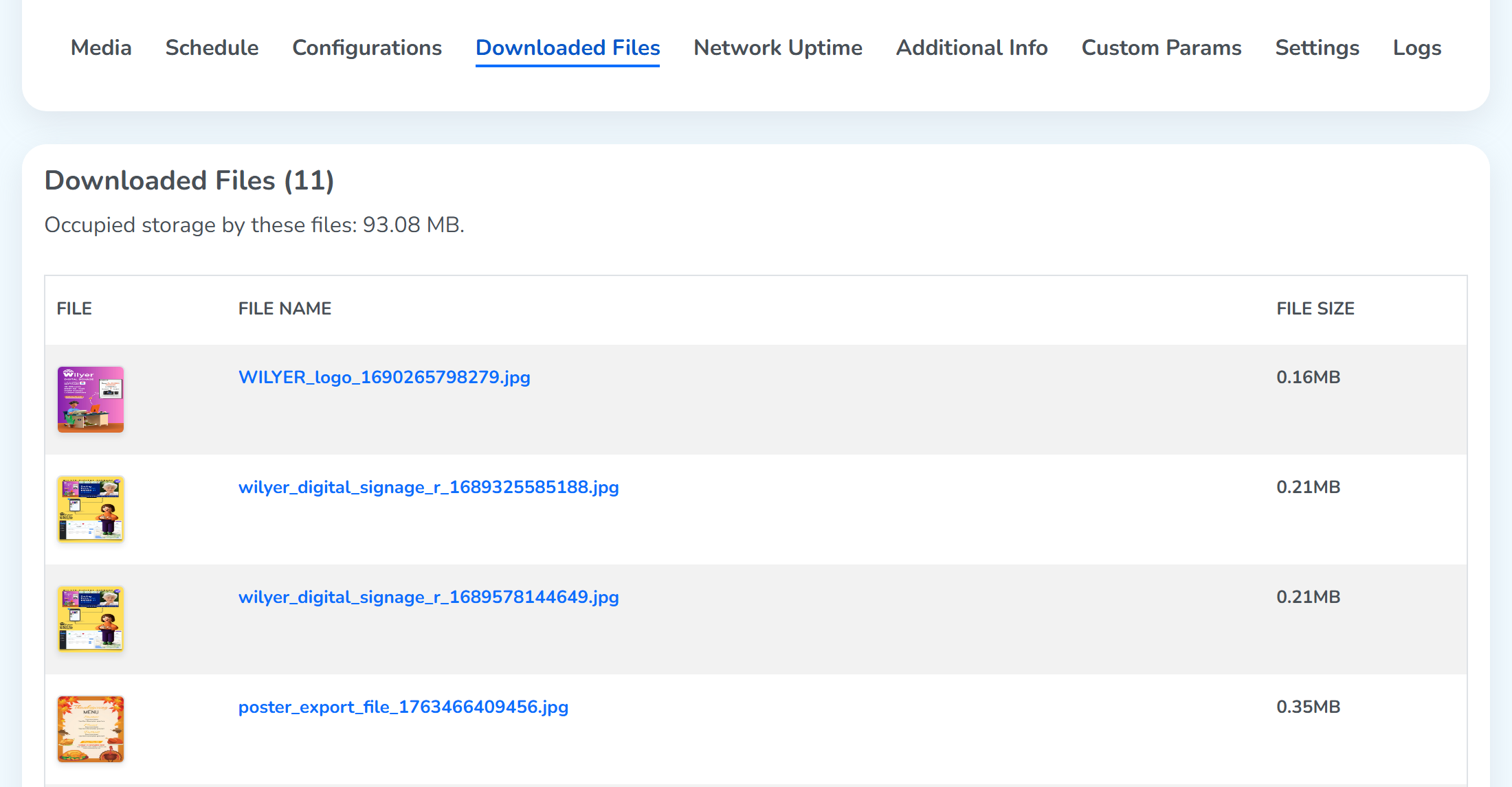 Total storage these files takeOne row per file, its thumbnail, name and size
The page shows total occupied storage and a row per file with its thumbnail, name, and size. Use this when troubleshooting playback. If a file is missing here, the device hasn’t pulled it from the cloud yet.
Network Uptime
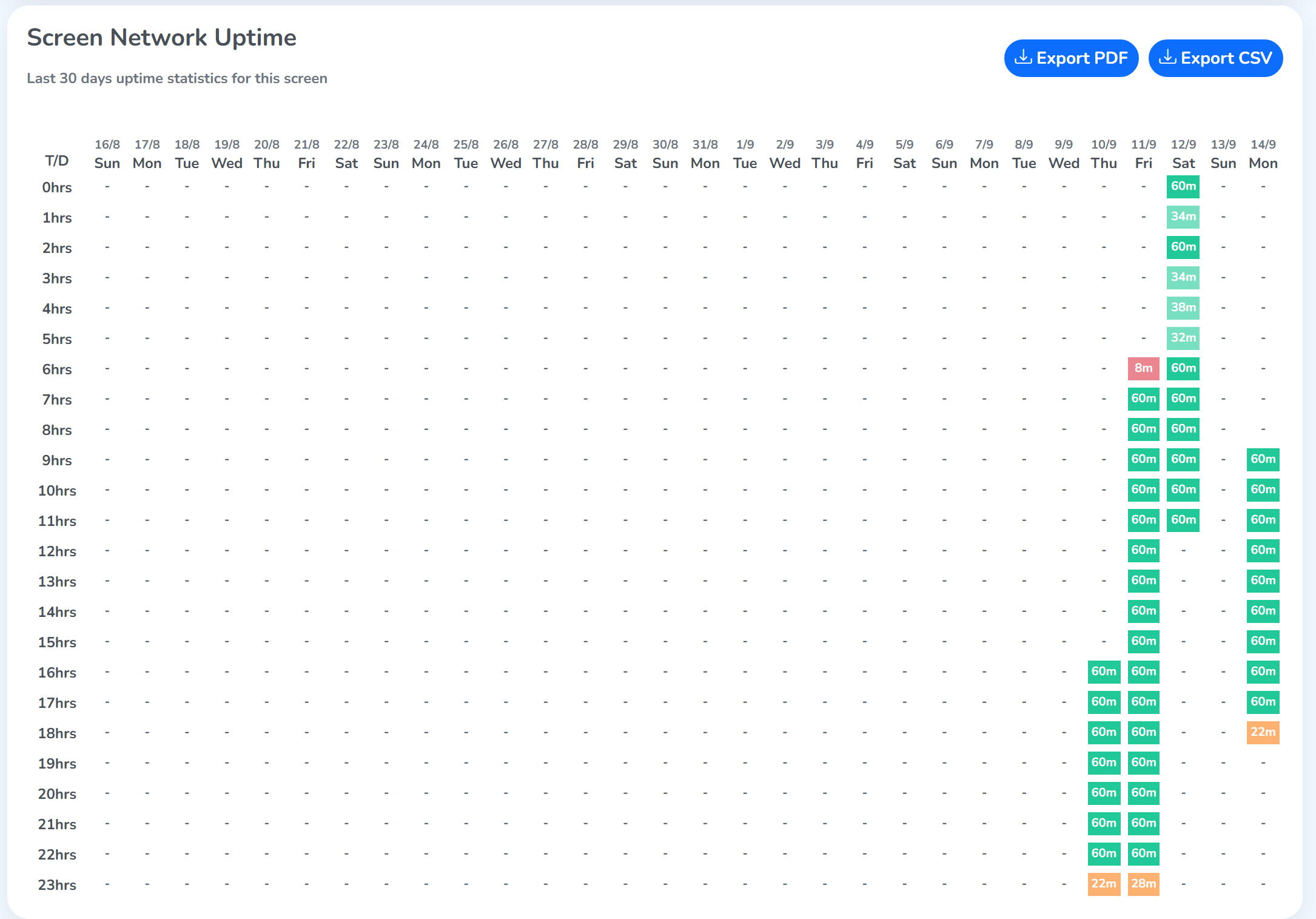
The grid shows how long the player app ran on this screen, hour by hour, over the last 30 days.
 24 hours, down the leftDays, across the top
- Left column: the time: the 24 hours of a day.
- Top row: the days, each with its date and weekday.
Together they show, for each day and hour, how many minutes the player app was running, whether showing content or working in the background. 60m is the full hour, and 8m means 8 minutes of that hour.
Additional Info
A read-only dump of everything the player has reported about the hardware.
Useful when filing a support ticket, includes device date/time, time zone, board, brand, model, dimensions, and OS version.
Custom Params
When different screens should play the same text with only one or two details different, custom params do the job. They work as key and value pairs.
Step 1: Customize a ticker in a playlist. To learn more about this process, review the Add New Widget – Ticker/Scroller section.
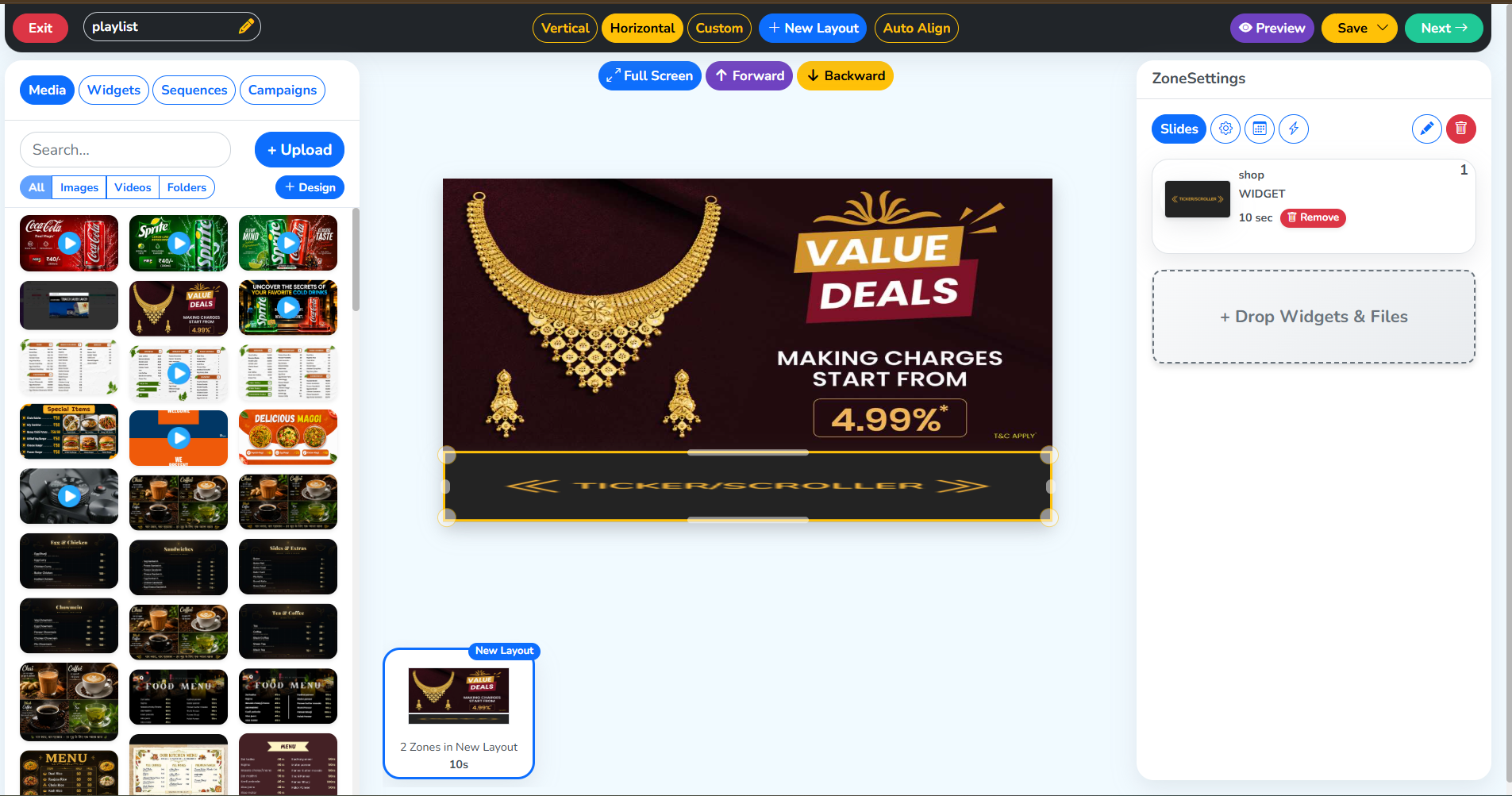 This plays the text content
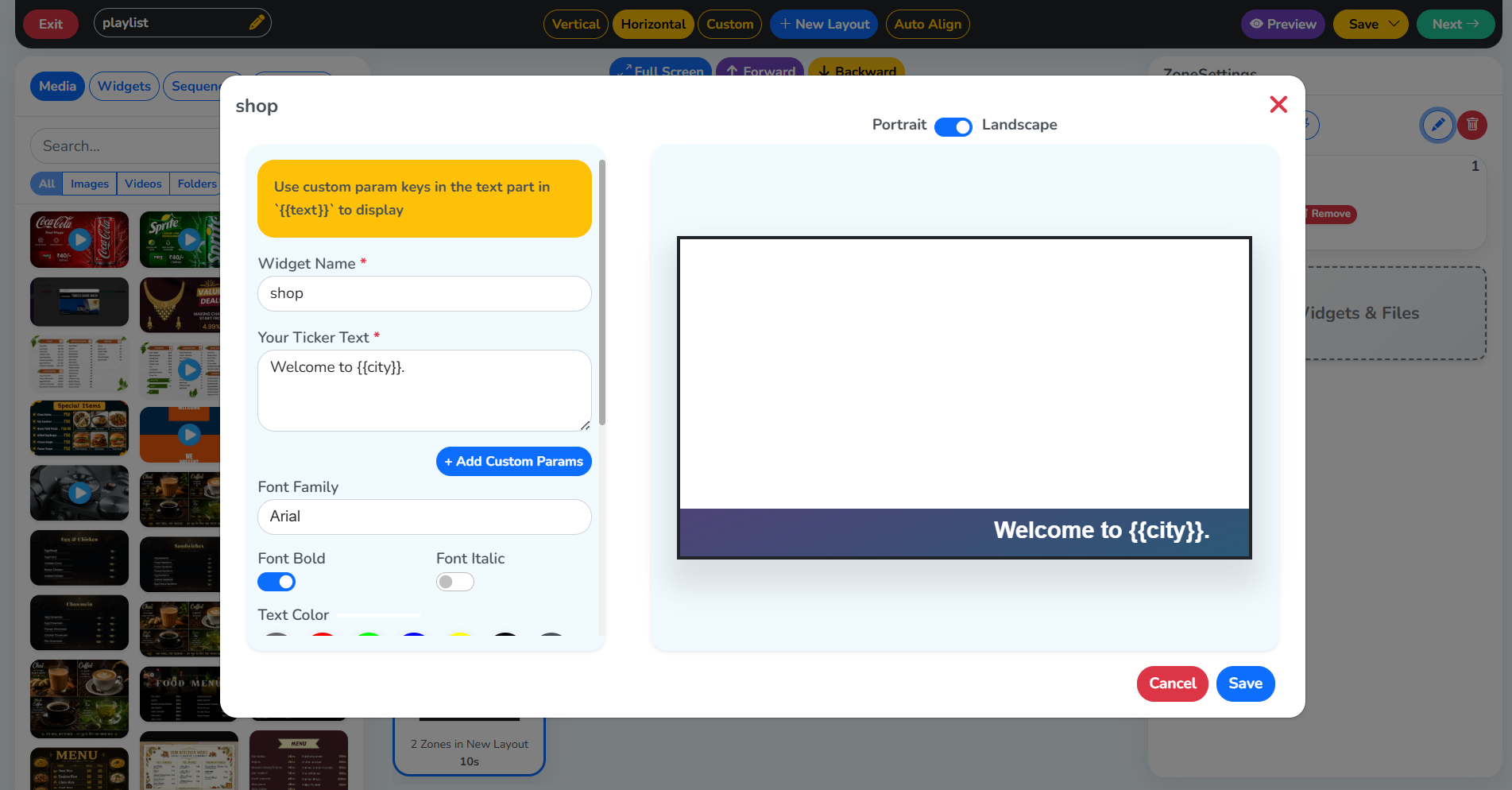
Step 2: Add the variable. The key must be enclosed inside two curly brackets (look at the yellow box below) to use different values in its place for different screens.
Step 3: Save the playlist. Click the blue Save icon and Next in the top right of this page.
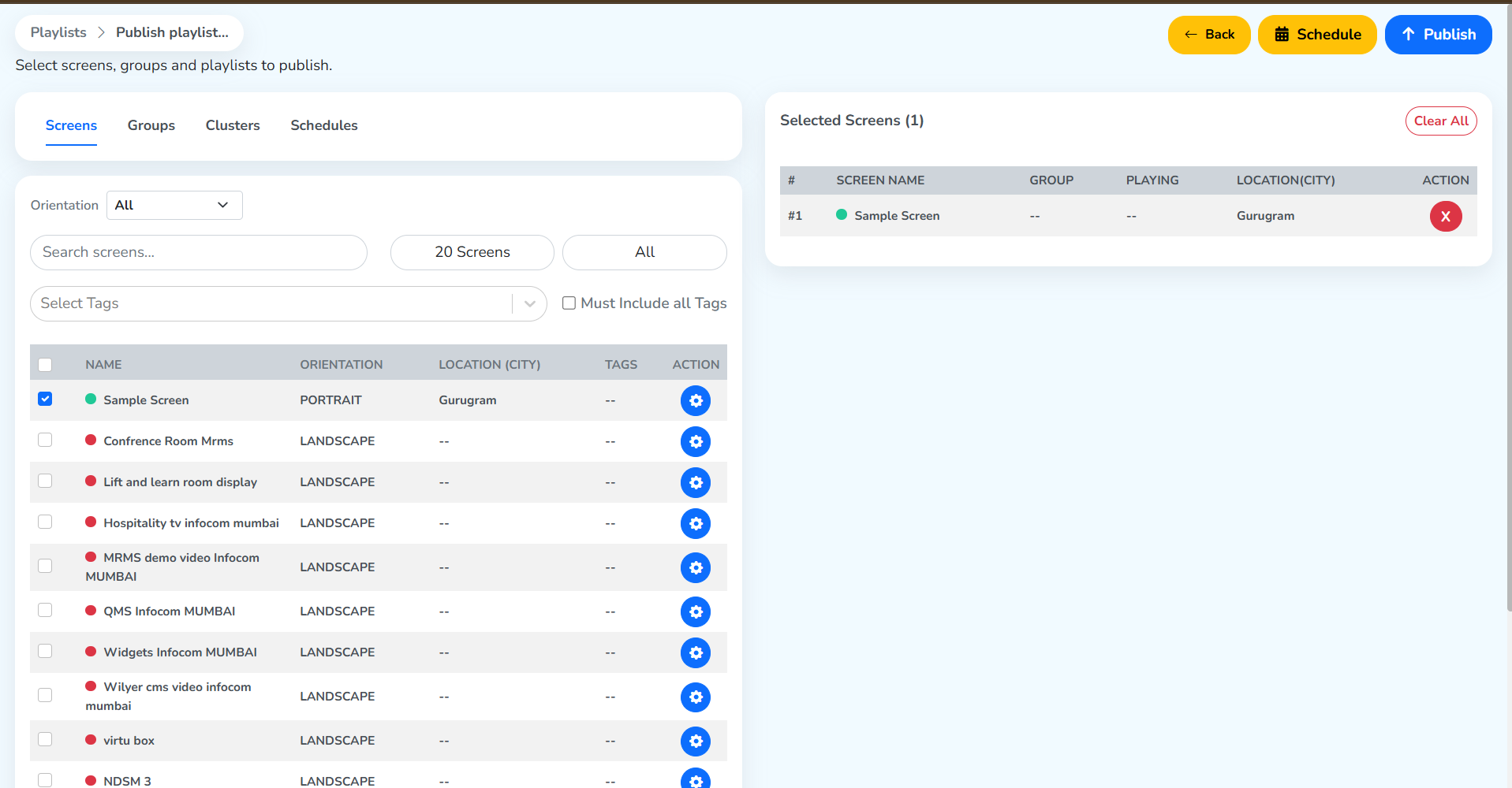
Step 4: Select a screen and publish. Select the box beside a screen and then click Publish to deploy the content on the screen.
Step 5: Custom Params. Go to the selected screen’s settings and click Custom Params. Select Add New, correctly mention the key that was used in the ticker text, and assign a value to it that would be displayed on this screen. Once done, select Update Params.
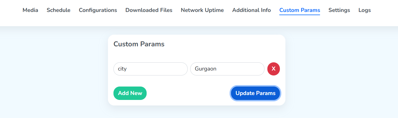
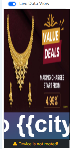
The proper content is now playing on the screen. In
Live Data View, the{{key}}appears like this only because it fetches the content from the CMS.
Settings
Lifecycle actions for this screen. These actions affect billing and the live screen. Read each description carefully.
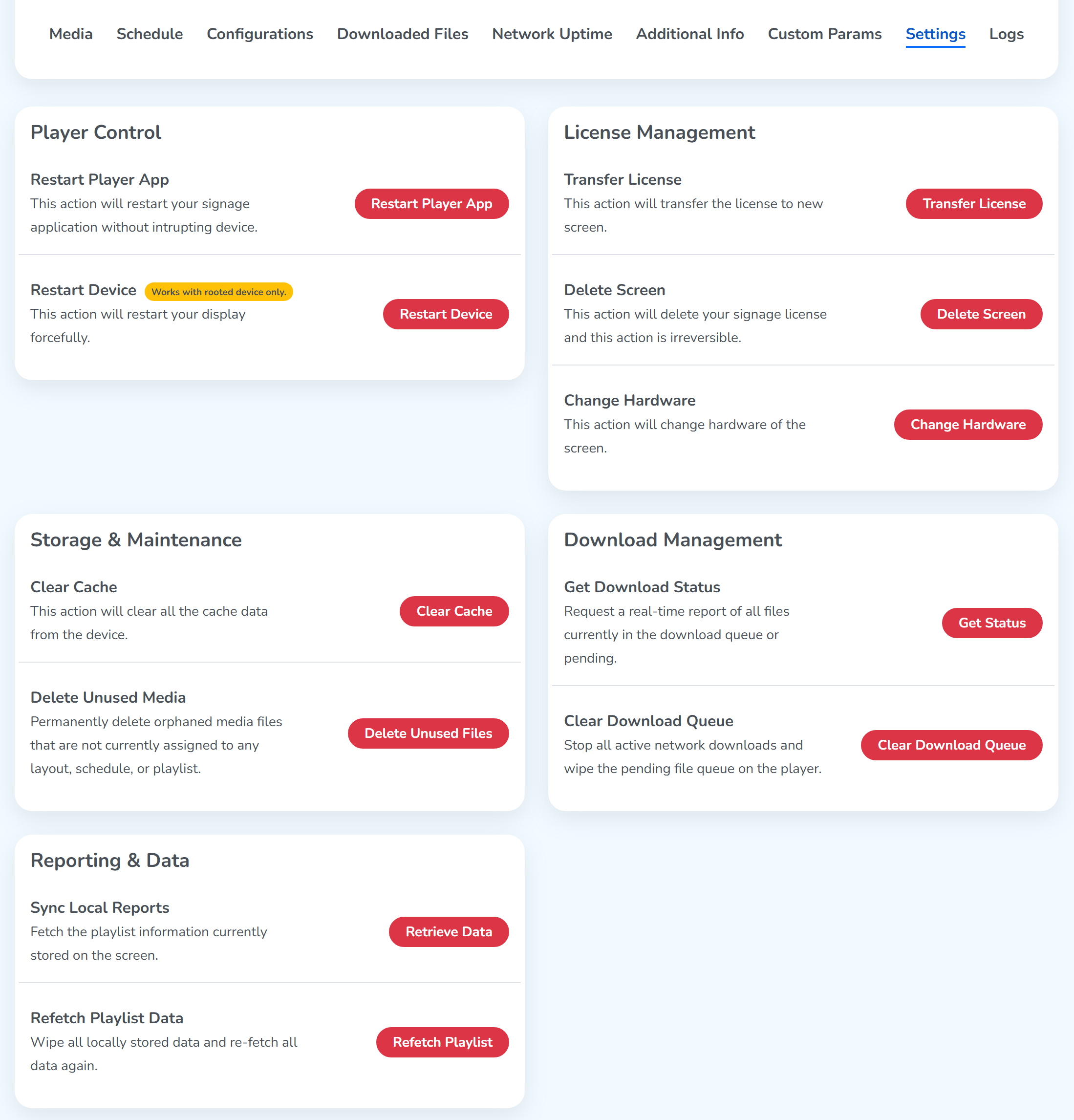
License Management
Transfer License
Click Transfer License to move this screen’s license to a different display. The dialog re-opens the pairing flow, so transferring really means re-pairing the license to a new device.
The fields:
- Pairing Code: the 6-digit code shown on the new display you want to pair to.
- Screen Name: pre-filled with the current screen name; edit if the new display deserves a different label.
- Orientation: set the new display’s orientation,
Auto,LandscapeorPortrait. Migrate Screen Uptime(checkbox): when ticked, the new device inherits the old screen’s uptime/analytics history. Leave unticked to start fresh telemetry.- Pair Screen: commits. The license moves; the old device becomes unlicensed and stops playing.
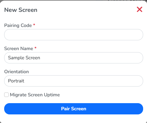
Use this flow when a player dies, when you swap a TV, or when you move a license from a temporary demo screen to its production home.
Delete Screen
Click Delete Screen to permanently remove this screen from your account. A confirmation dialog asks before committing.
Where it goes: the screen moves to the Deleted Screens tab on the Screens list, where each row carries its own Restore button. Restoring asks for a fresh pairing code from a display, so a restored screen is a screen paired again rather than the old device coming back.
The screen’s activity log entries remain. Only the screen itself goes.
Logs
Recent activity for the device.
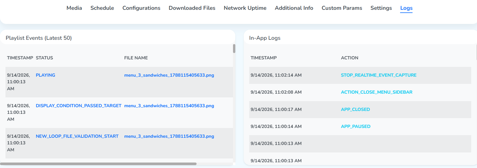
- Playlist Events (Latest 50): every time the player switched, paused, or reported a media error.
- In-App Logs: UI-level events (button presses, navigation).
Use logs alongside Network Uptime to diagnose intermittent issues.